I recently gave a short talk about Tipa.li at a local dev convention in Tel Aviv, which in turn sparked some brief discussion of its user experience on Twitter. Some criticized it for being too sparse, having no exposition, so to speak – no introduction to explain what it’s about, guide you on how to use it etc.
It’s true. When a user opens http://tipa.li on their (generally mobile) browser, they’re just prompted to allow it to access their location:
And then are shown a neighborhood-level map centered at their location with some markers. Clicking a marker shows the details for a baby wellness clinic – opening times, address, phone number.
The Twitter conversation made me realize this is what I’ve been trying to do all along, with all UIs I had the chance to build or influence. Part of this minimalism is due to pure laziness, but it’s also about particular moment I think good UIs can recreate.
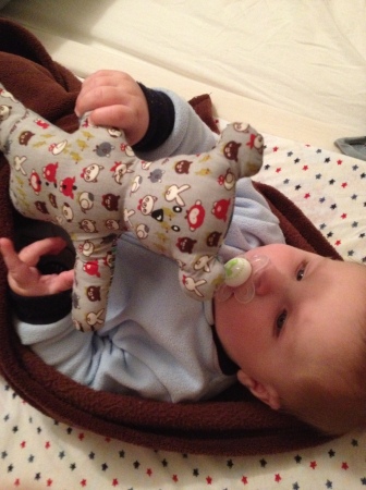
Omri, my son, is now four months old and starting to learn how to use his hands to grab things and move them around (most of time eventually trying to eat them). A great UI can replicate that feeling of getting acquainted with a new object for the first time, tinkering with it a bit, figuring out how to operate it and what it does.
Of course there’s the threat that the interface will be too cryptic for most users to bother with. Fortunately Tipa.li is too tiny to really risk this, but thinking about it instills some respect for the achievement of truly great products, like the first iPhone, which manage to be instantly usable while keeping a sense of wonder about the experience.


